Eighty cents of your dollar
The headline was: "Two Lesbians Raised a Baby And This Is What They Got." It was written by Angie Aker at MoveOn. The story was later told at conferences by people from Upworthy, the viral site where they'd write as many as 25 headlines for a single post and test which one won.
Why did it work? The original headline was a folder label. It said what the video was about but gave no reason to press play. The new one added a topic that was splitting America in 2011, plus an open loop: "this is what they got." The brain got a question, and the answer was one click away. The video didn't change by a single second. Only the promise did.
Advertising legend David Ogilvy, who among other things wrote the famous Rolls-Royce ad, put it in his 1963 book Confessions of an Advertising Man: on average, five times as many people read the headline as read the body copy. When you've written your headline, you've spent eighty cents out of your dollar. Ogilvy had no Google Analytics and no eye-tracking. He was just right.
So if you spend a minute on the headline and an hour on the copy, you've got the ratio backwards. Don't worry, you're in good company. #confession
The first two words decide
Remember the F-shape from part two? Eyes read the first line, then slide down the left edge, catching only the beginnings. In 2009, Jakob Nielsen of Nielsen Norman Group measured it even more closely: with lists and links, people typically see only about the first two words. In one test, 80 people were shown just the first 11 characters of links. For 35% of the links, people had no idea where they led. The best one, a plain "Gift Cards," let 85% of people predict the destination.
Which gives you the simplest advice of the whole trilogy: put the important part first. Not "News from our salon: starting in November we offer lash lifts." Instead: "Lash lifts, now here from November." Not "Q3 results and next steps." Instead: "Texas fell 8%. Here's why." Save the warm-up for the gym.
Three keys to the doorman
In part one I promised we'd break down the three things the doorman rarely resists. So here they are, with tools in hand.
1. It's about me
Back in 1977, psychologists described the self-reference effect. In an experiment by Rogers, Kuiper and Kirker, people best remembered words they'd judged by whether the words described them. Better than words they'd judged by meaning. The brain processes anything labeled "me" more deeply.
- Before: "We offer accounting services for businesses."
- After: "Running an online store and facing your first sales tax filing in January?"
The second one speaks to fewer people. That's exactly why it works. Whoever recognizes themselves in it keeps reading.
2. I didn't see that coming
In 1933, German psychologist Hedwig von Restorff found that in a list of similar items, people best remember the one that's different. One red word among black ones. One unsmiling photo in a gallery of smiles. The brain saves energy by reading patterns. Whatever breaks the pattern has to be processed by hand.
- Before: "Black Friday: up to 50% off." (Same as nearly everyone else that day.)
- After: "We're closed on Black Friday. Here's why."
One caveat: the surprise has to make sense. The gorilla in part one walked across the court and half the people still missed it. Unexpected isn't enough. It has to show up where the reader is actually looking, which means the headline and the first sentence.
3. I feel something
Jonah Berger and Katherine Milkman of the Wharton School went through nearly 7,000 articles from the New York Times homepage over three months and tracked which ones made the most-emailed list. Emotion decided, especially the kind that fires people up: awe and amusement, but also anger and anxiety. Sadness, on the other hand, slowed sharing down. A sad person crawls under a blanket. A fired-up person has to do something.
- Before: "Tips for saving money on marketing."
- After: "Last year we burned $4,000 on ads. Here's where it went." (Only if it's true. Emotion built on a lie lasts until the first comment.)
Now a little test. The headline of part one was "Half of People Miss the Gorilla. They Miss Your Ad Too." A number you don't expect (half). A gorilla you don't expect at all. And "your ad," something that's about you. All three keys in one line.
Short or long?
A common question: "Isn't this too long?" The answer from part two still stands. Length isn't the problem. The problem is when nobody sold the copy to the reader at the start. The same person who won't finish three paragraphs of a dull email will binge three episodes of a show tonight.
My rule is simple: the length of the copy matches the cost of the decision. A text message, a sign or a notification asks for a small decision (I'll come, I'll stop by, I'll click), so one sentence. A $3,000 course or picking a vendor for three years asks for a big one, so long copy is fine. People making big-money decisions like to read. They just want to know why they should, and they find that out from the headline and the first sentence.
One more thing: long copy has to work for the scanner too. Subheads that tell the story on their own. Bold words that carry the point. Someone who reads only the skeleton should understand what it's about. Someone who wants more will find it in the text.
A beauty salon and its three doormen
In part one I promised a beauty salon on the edge of town that we'd walk through its three doormen. Each one stands at a different door, and each gives you a different amount of time.
The roadside sign. People read it while driving or walking, so it gets barely a few seconds. No sentences, just a promise.
- Before: "Jana's Beauty Salon – facials, manicures, pedicures, lashes, brows, waxing"
- After: "Lashes in 45 minutes. Park right by the door."
The Instagram post. The first line before "…more" decides.
- Before: "Dear clients, we'd like to let you know about our November news…"
- After: "Tuesday evenings just opened up for November. First three to book get them."
The text message. People read the preview in the notification, not the whole message. So what matters has to be in the first words.
- Before: "Hello, Jana's Beauty Salon would like to remind you of your appointment on…"
- After: "Tomorrow 4 pm, lashes with Jana. Can't make it? Reply NO."
Notice that none of the "after" versions are funnier or more creative. They just start with what the client cares about, not what the salon cares about.
A corporation in Miami and the doorman in the boardroom
In a big company, the doorman stands at the email subject line, the slide title and the first sentence of the executive summary. "Update – Project Atlas" is a folder label. "Atlas: I need your sign-off by Friday or we push the launch" is a reason to open the email. A slide titled "Texas Revenue Q3" hands the board a riddle. "Texas fell 8% because we lost two distributors" hands them the conclusion, and the table underneath is just the evidence. The board has as little time for your slide as a driver has for your sign. They just have better chairs.
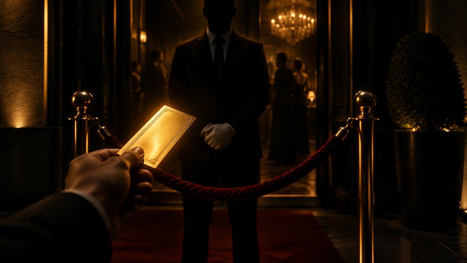
Expert perspective: "For twenty years I've been fixing copy, and I almost always fix the same thing. People start with what they want to say, not with what the reader wants to hear. You can't sweet-talk the doorman or bribe him. You can only show him a ticket. And the ticket is the first sentence," says Michal Krčmář, founder of Don Marketer and a CMO with nearly two decades of experience in global marketing.
The 10-second test
I promised it at the start, so here it is. Before you send any copy out, read only the headline, the first sentence and the subheads. Nothing else. Then ask three questions:
- Is it about someone specific? Does the reader recognize themselves within the first few words?
- Is there something they don't expect? A number, a twist, a line that a hundred other companies didn't write?
- Do they feel anything? Curiosity, amusement, a slight unease. Indifference doesn't count.
Two "no" answers and the copy goes back on the desk. No debate. "Zach Wahls speaks about family" gets three "no"s. The other headline gets three "yes"es. The rest is 20 million views.
The takeaway
Brain Overload is a wrap. The brain first filters your message out (part 1), then only scans it (part 2), and lets through only what promises it something in the first few words (part 3). The good news is that all of this rests on a handful of sentences. The headline, the first sentence, the subheads. Get those right and you don't need a bigger budget. You need more time with your first ten words.
And if you read this whole trilogy by headlines and subheads alone, that's fine. At least you know they work.
And if you want to know how much to put into brand so people remember you, and how much into performance so they find you, the Don Marketer calculator will work it out in 2 minutes.
Sources: MIT Center for Civic Media: Upworthy and the art of the headline (the Zach Wahls video story, 25 headlines per post); Campaign: Excerpt from 'Confessions of an Advertising Man' (David Ogilvy, 1963); Nielsen Norman Group: First 2 Words: A Signal for the Scanning Eye (Jakob Nielsen, 2009); T. B. Rogers, N. A. Kuiper, W. S. Kirker: Self-reference and the encoding of personal information (Journal of Personality and Social Psychology, 1977); H. von Restorff: Über die Wirkung von Bereichsbildungen im Spurenfeld (Psychologische Forschung, 1933); Scientific American: The Secret to Online Success: What Makes Content Go Viral (Berger & Milkman, Journal of Marketing Research, 2012); the author's own experience.